For my publication beyond, I developed an identity that exemplifies a focus on innovations in transportation technologies through conveying dynamic movement and comfortability in the publication wordmark and typographic design system.
Wordmark Foundation / Concept Statement


In developing my publication wordmark, I utilized the geometric sans-serif typeface Neue Kabel to communicate comfortability and momentum visually and exemplify a focus on innovations in transportation technologies in my publication content.
Typeface Exploration / Ideation
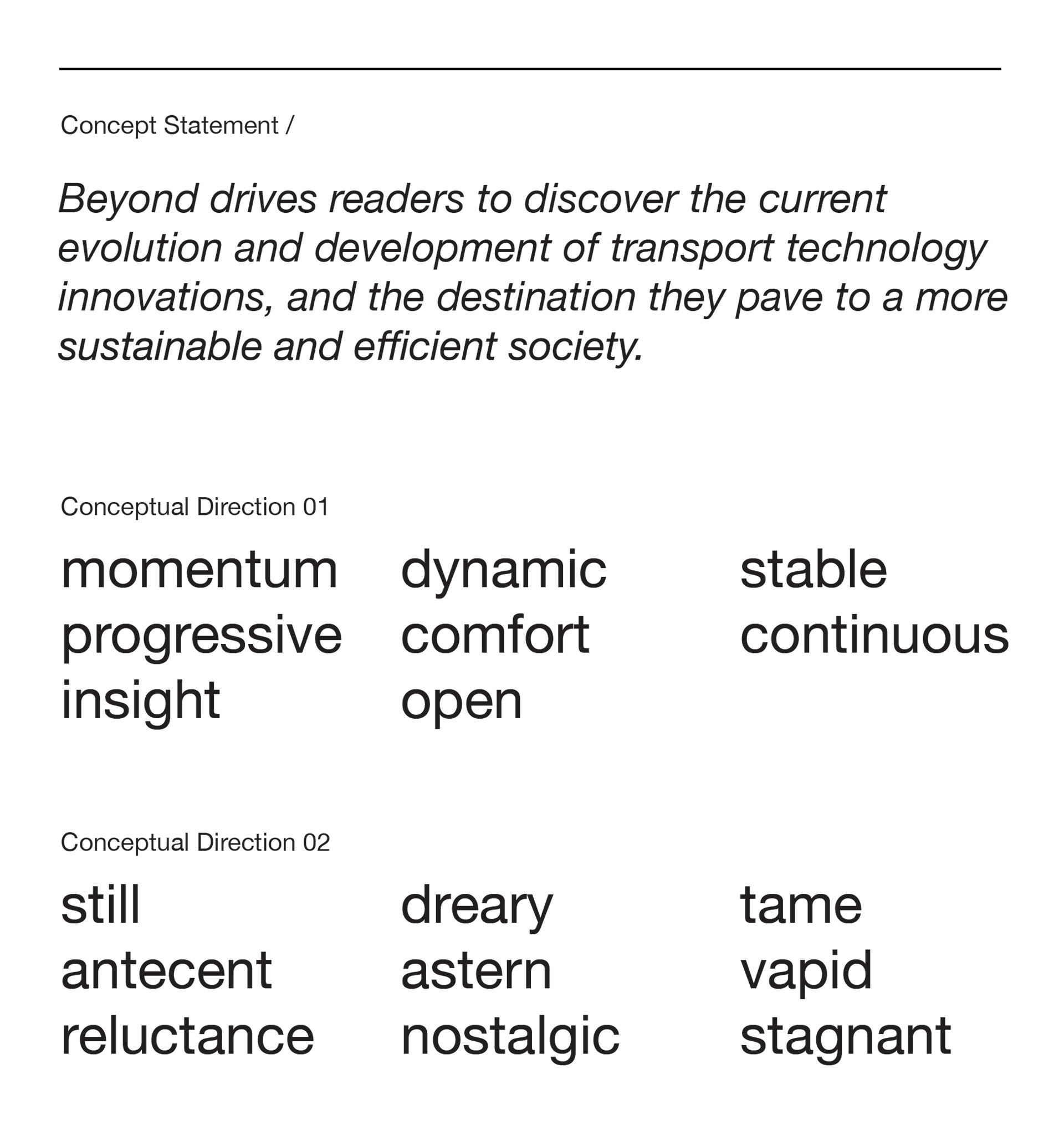
In the first phase of this project, I developed a concept statement to reflect the subject of my publication, as well as conceptual directions to reflect the typeface choices. Over the many typefaces I explored, I wanted to reflect the modernity and futurism of transportation innovations as well as a sense of comfort and friendliness in the ideas present in my concept statement.
Wordmark Sketch Iterations
Using the typeface choices from the previous phases, I traced each choice onto vellum paper to discover what could be changed or added to each typeface to suit my concept statement and conceptual directions better.
Final Wordmark
Using our successful iterations from our sketch-work, I rebuilt my typeface modifications in Adobe Illustrator. For building my final wordmark, I had chosen the sans-serif typeface Neue Kabel for its geometric letterforms and simplicity, as well as its sense of movement and dynamics from its italics.
Visual System Development
In the second phase of this project, we created a grid system to employ typographic standards to develop a hierarchy of information for our publication identity. Developing a successful typographic system was explored through a cover, table of contents, feature article, and an interview article.
A typeface pairing for the header and body copy was explored to match the visual language of the publication identity. In my typographic style guide, I ultimately chose Roc Grotesk (Wide, Bold) for my headers as a comfortable and dynamic typeface and Lato for a legible and welcoming typeface for the body.
Table of Contents
In the development of my table of contents page, I employed a system of typography to represent the dynamic progress of transportation technology innovation and to communicate visually the idea of momentum with the type.
Feature Article Iterations / Process
Beyond - Final Publication