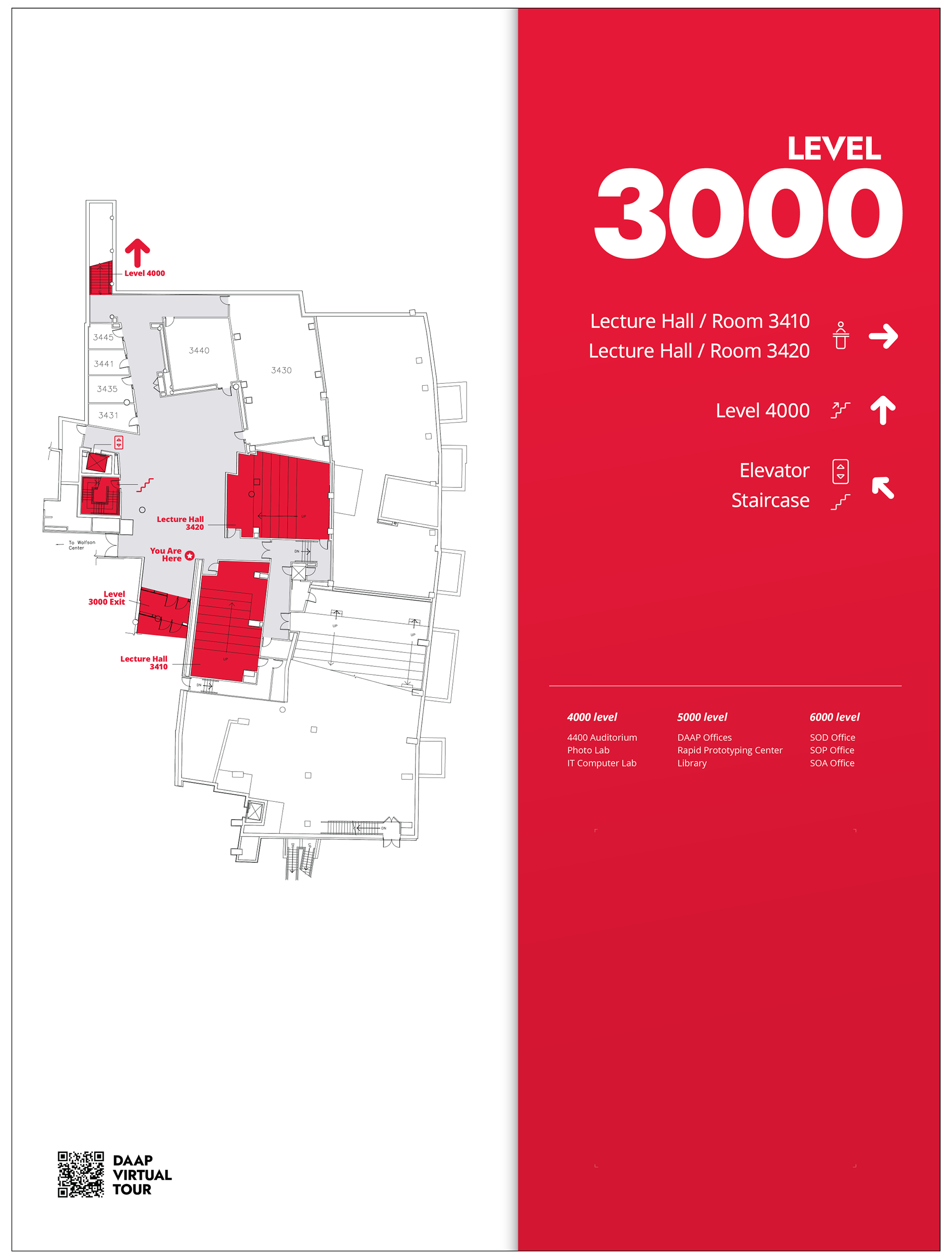
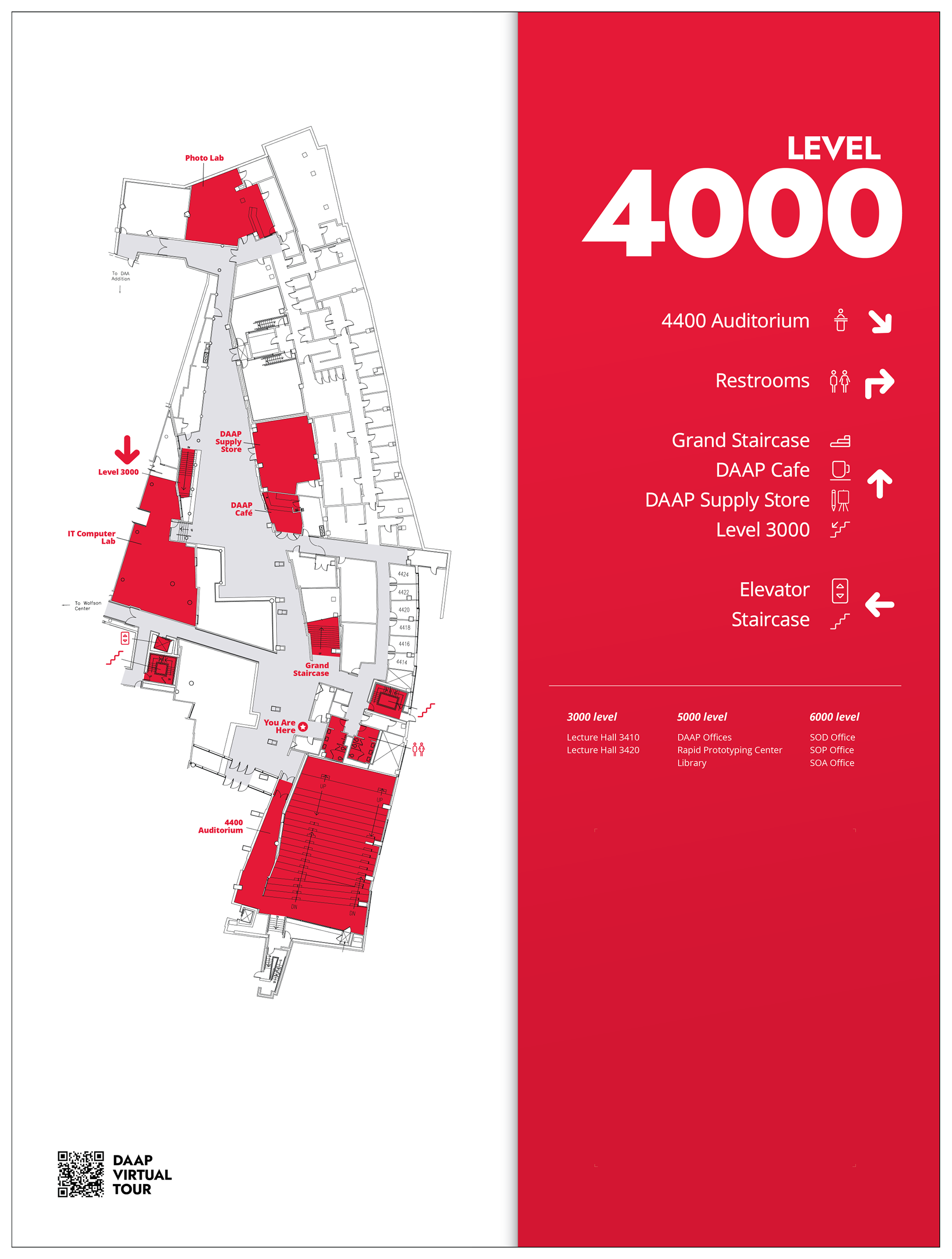
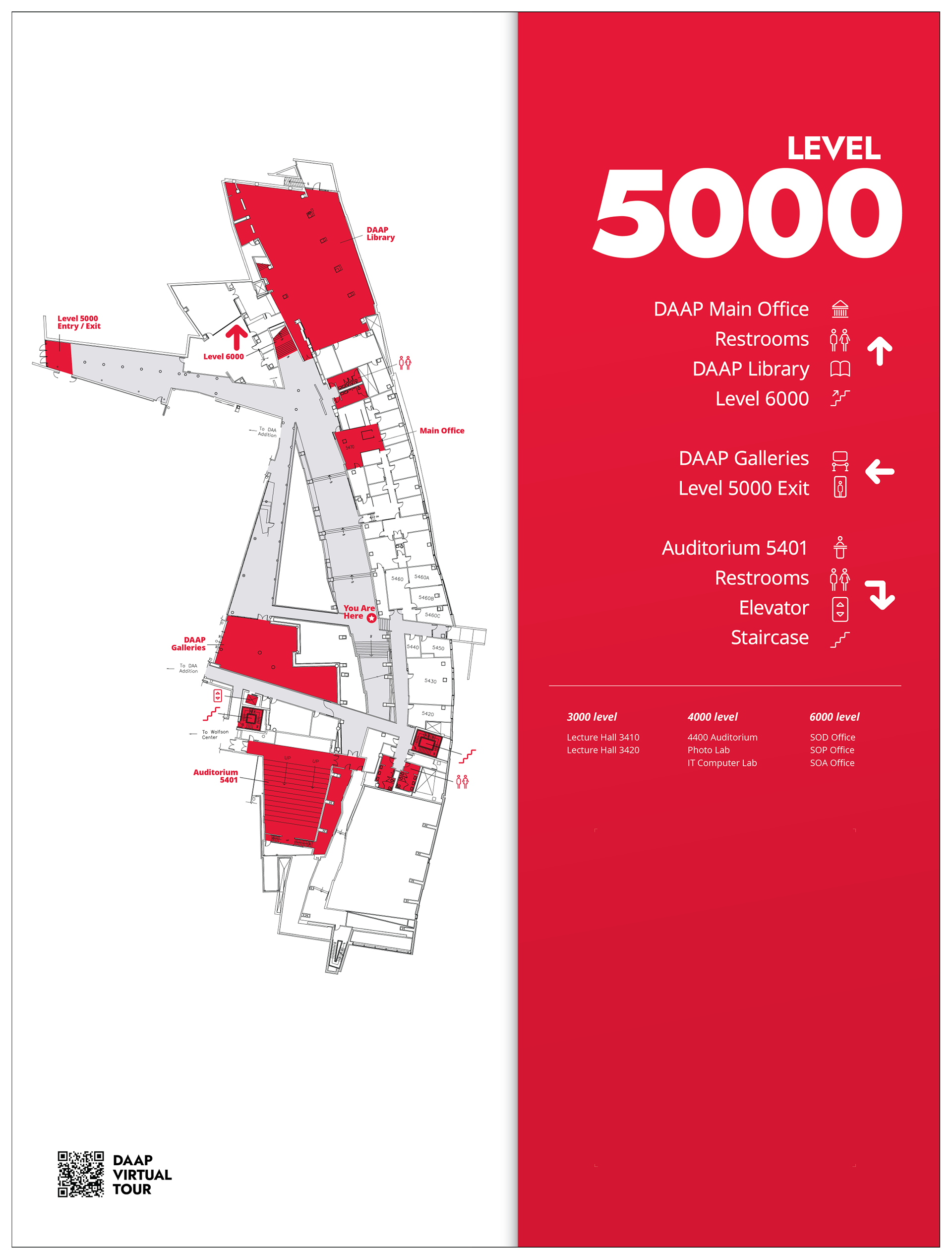
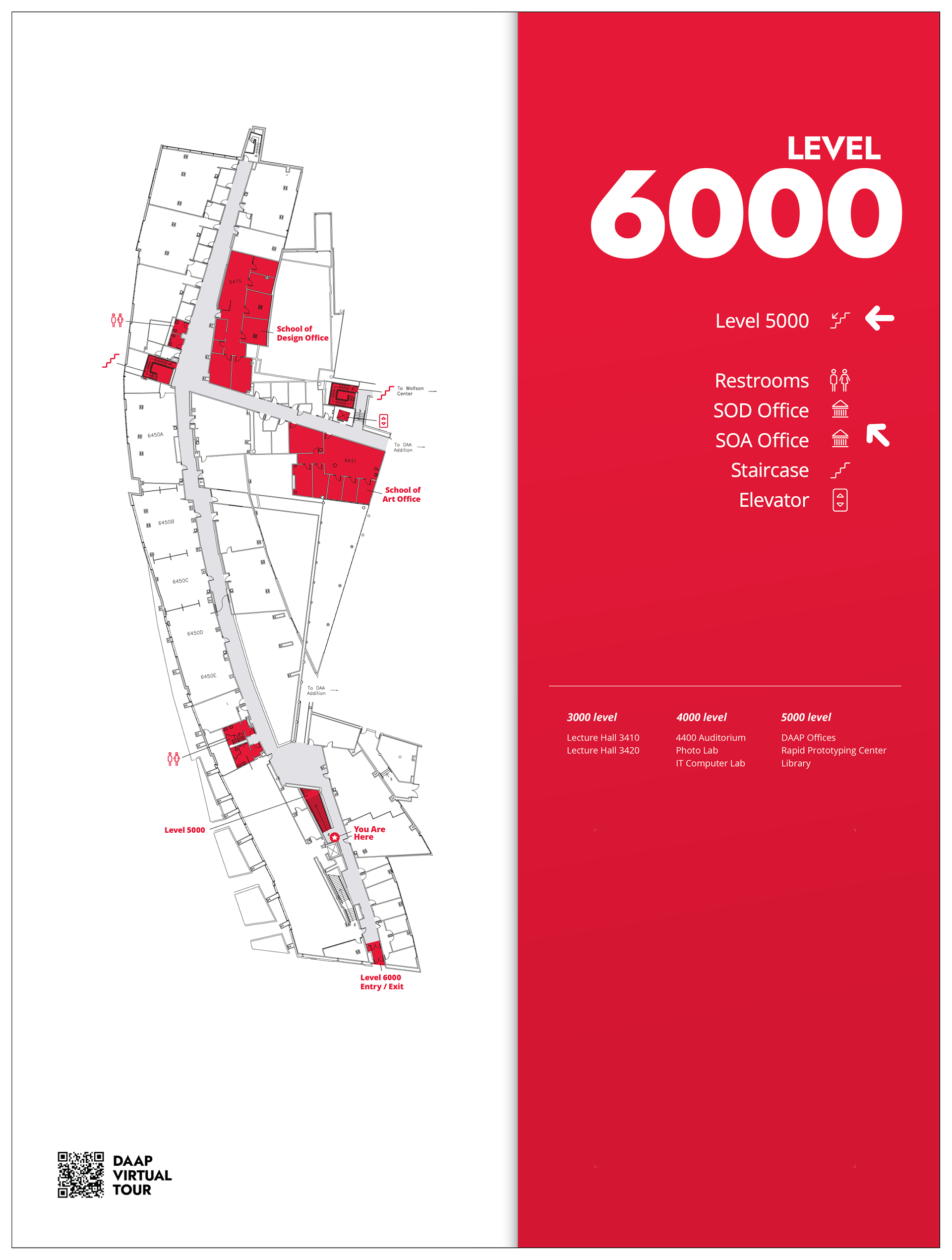
During my fall semester [2023], I got to co-op with the fantastic Marketing & Communication team at DAAP! As a co-op student, I worked on digital assets for upcoming DAAP events and exhibitions, social media campaigns, web materials, and in-house printing and photography.
As a personal project during my semester, I had the opportunity to exemplify my environmental design skills established from my previous work experience at OSU. For this project, I had to develop a series of large directional signage across four levels of DAAP to ensure greater efficiency for new students and visitors unfamiliar with navigating the building. Across each piece of signage, I emphasized key areas of DAAP utilizing typography and design skills from my coursework and professional experiences. My co-op mentor Sebastian, helped to approve decisions made throughout the process.
Initial Benchmarking
During the first stage of this project, I took to Pinterest and Behance to look for successful cases of wayfinding design to gather inspiration and a design direction for the project.
Hierarchy of Requirements
After benchmarking, I considered the elements that created successful directional signage and the key aspects of the project development. Outlining materials, typography legibility, and how to accommodate UC branding was important to consider to move forward with the project. During this stage, I built a Miro board to track production and organize project development.
Rough Sketches / Planning
Location Scouting
Continuing after sketching ideas and drafting visual characteristics, I was assigned to photograph areas across each floor where signage would be most crucial for navigating to key areas around DAAP. After photographing the most traversed areas of the building, I was able to narrow down my selections to five directional pieces. One for 3000, 4000, and 6000, while floor 5000 would have two pieces of signage. Key areas and their respective positions from potential signage spots were also kept track of,
Key Visual Development
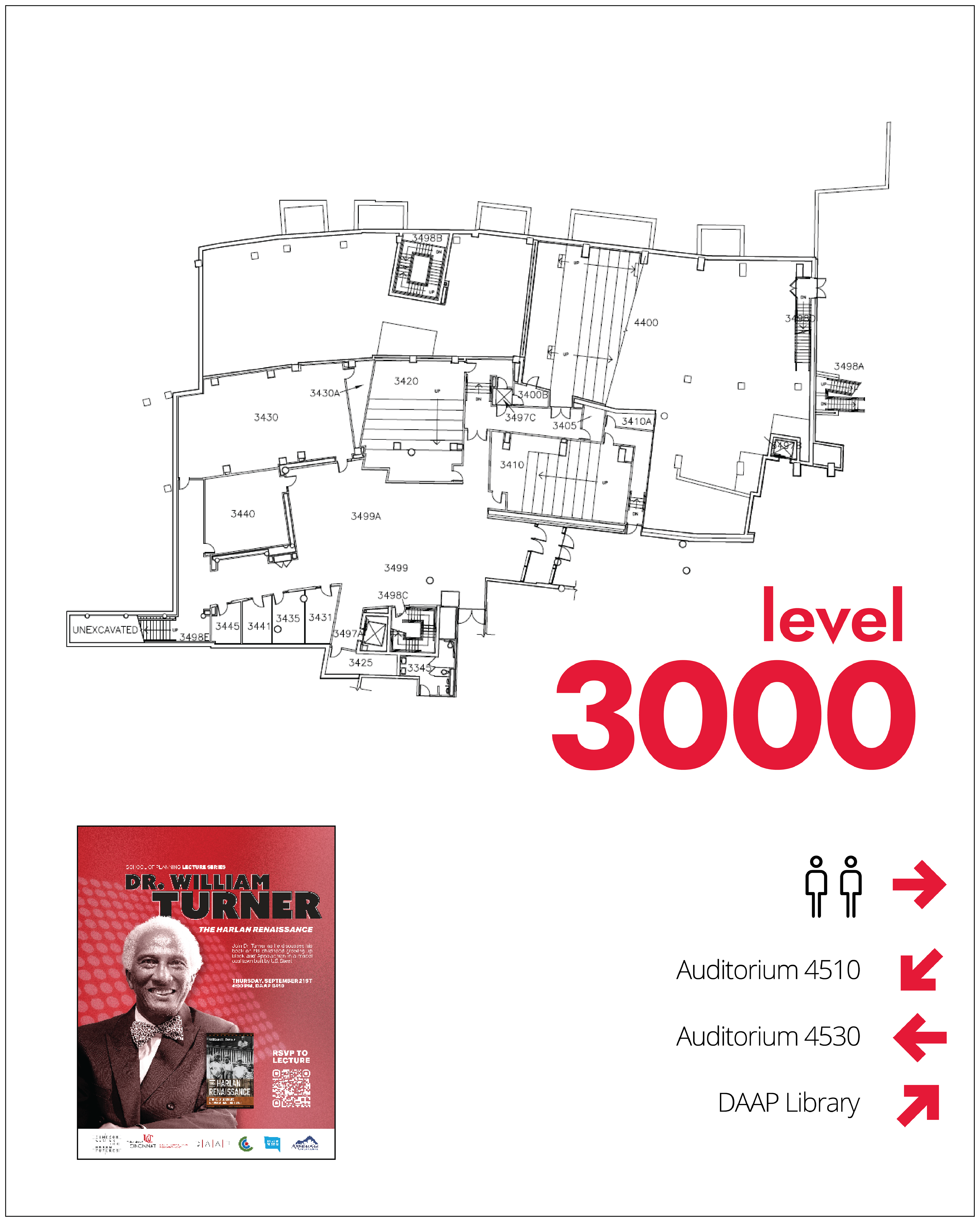
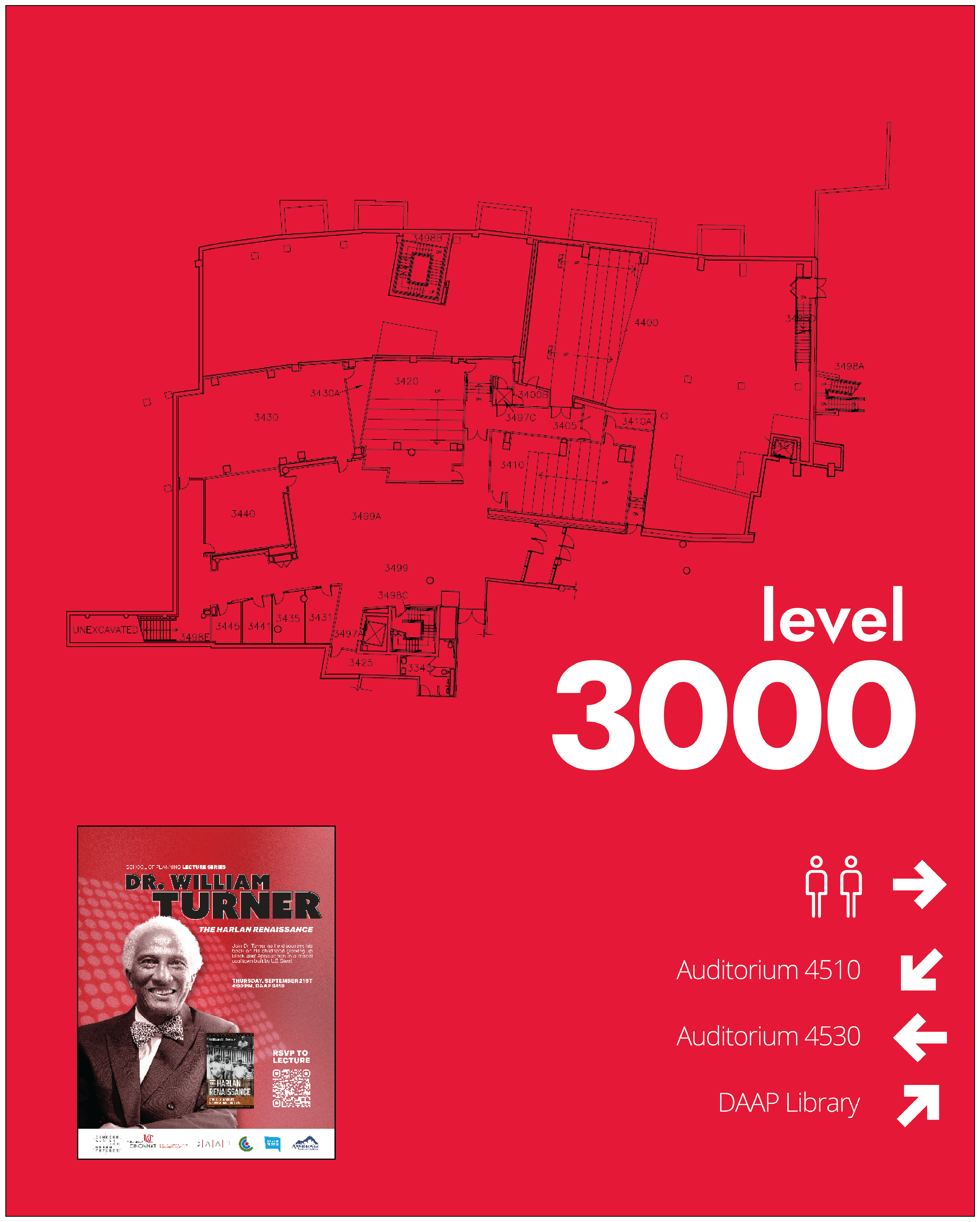
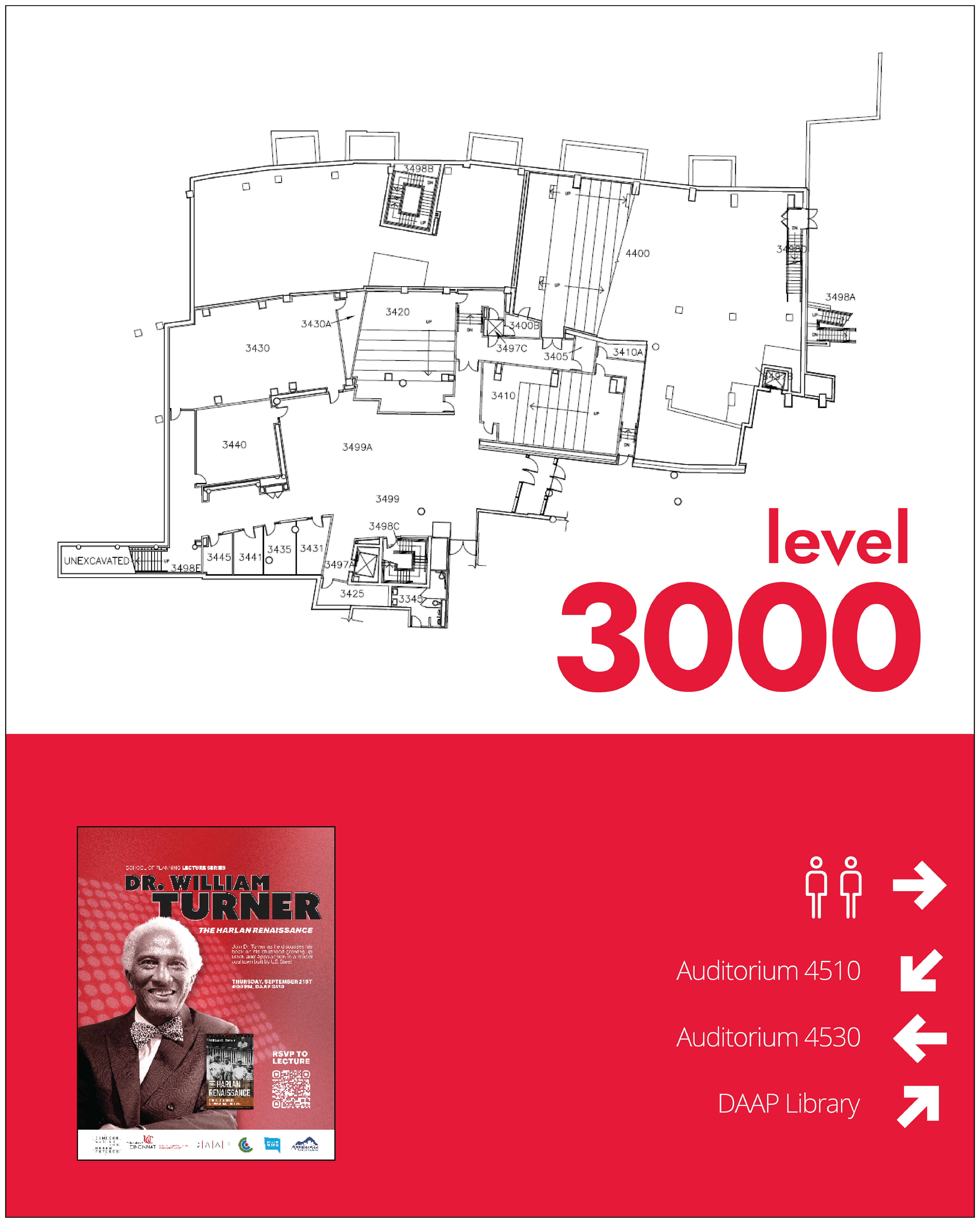
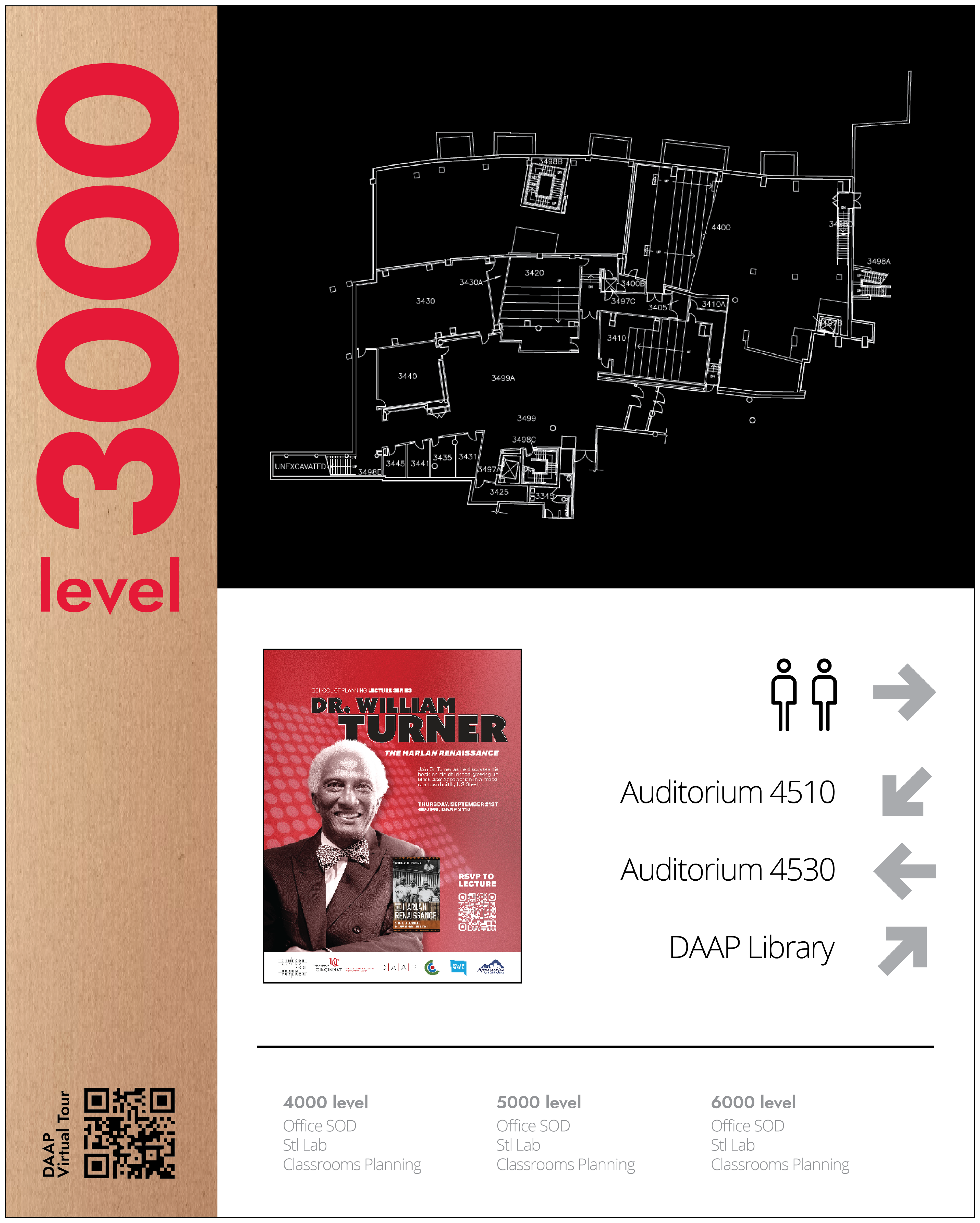
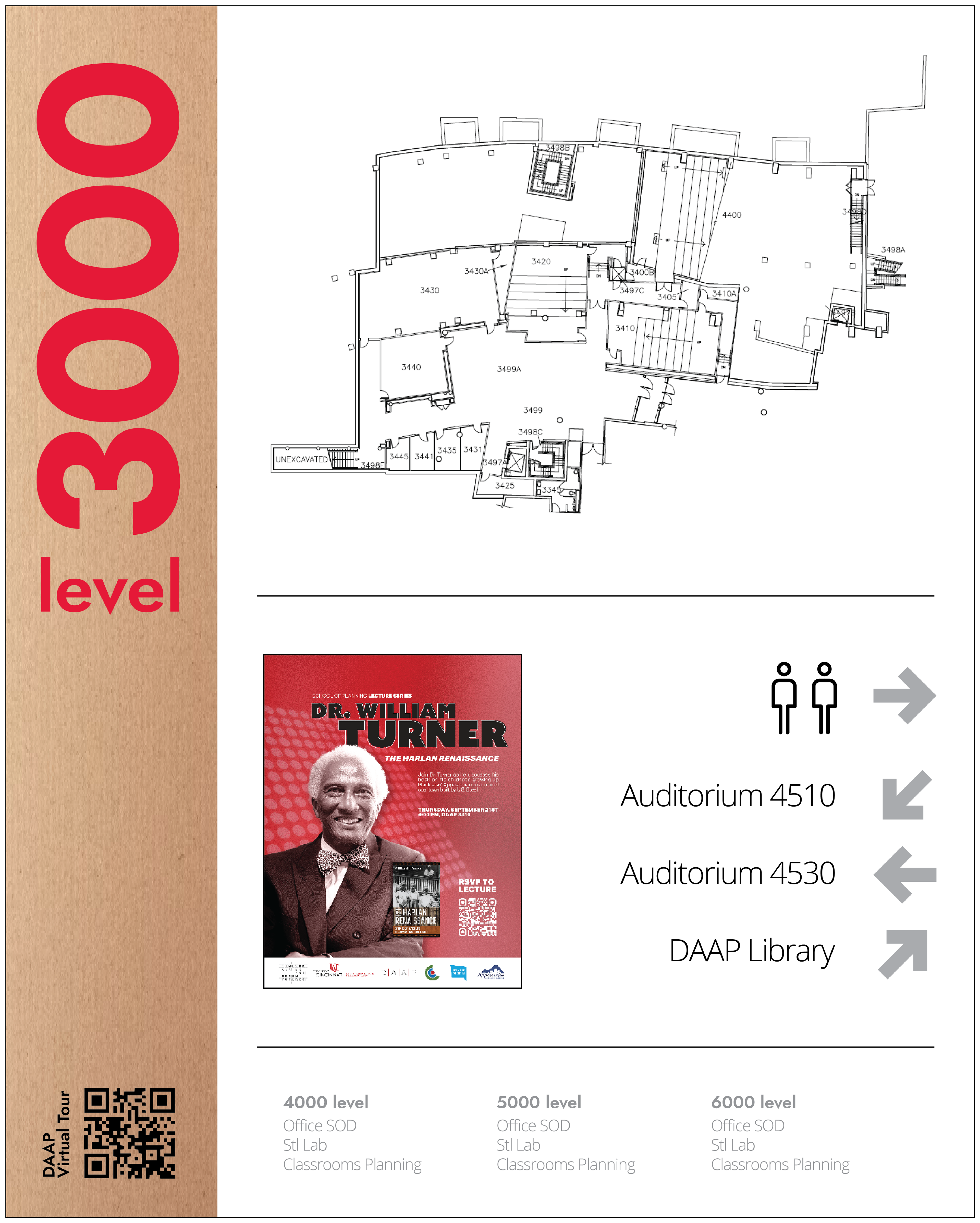
During my development of key visuals, UC branding, and legible typographic choices constructed the foundation for my first series of concepts. Incorporating a map of each floor was also incredibly important to highlight, but took work to reduce the amount of information across each visual.
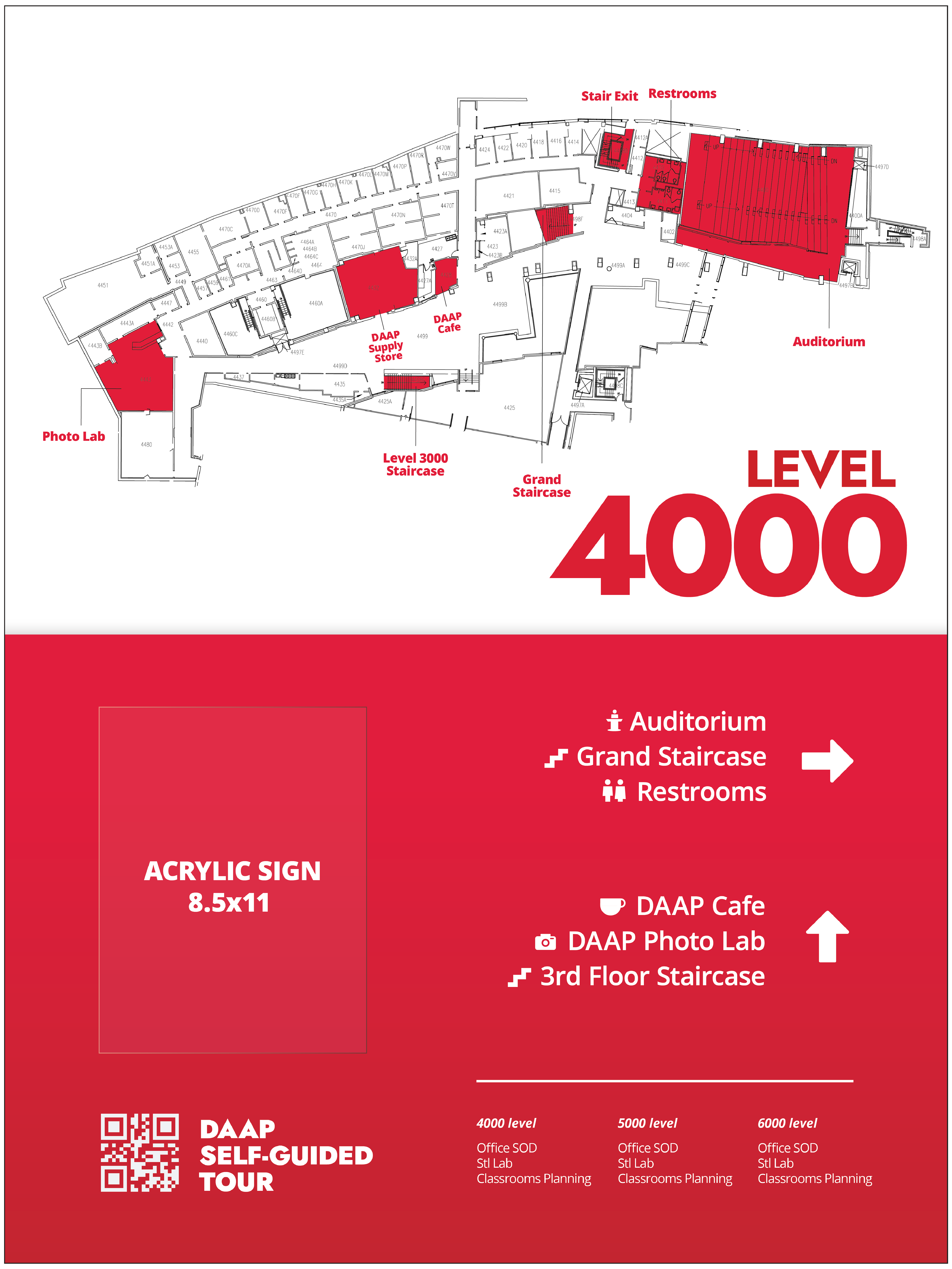
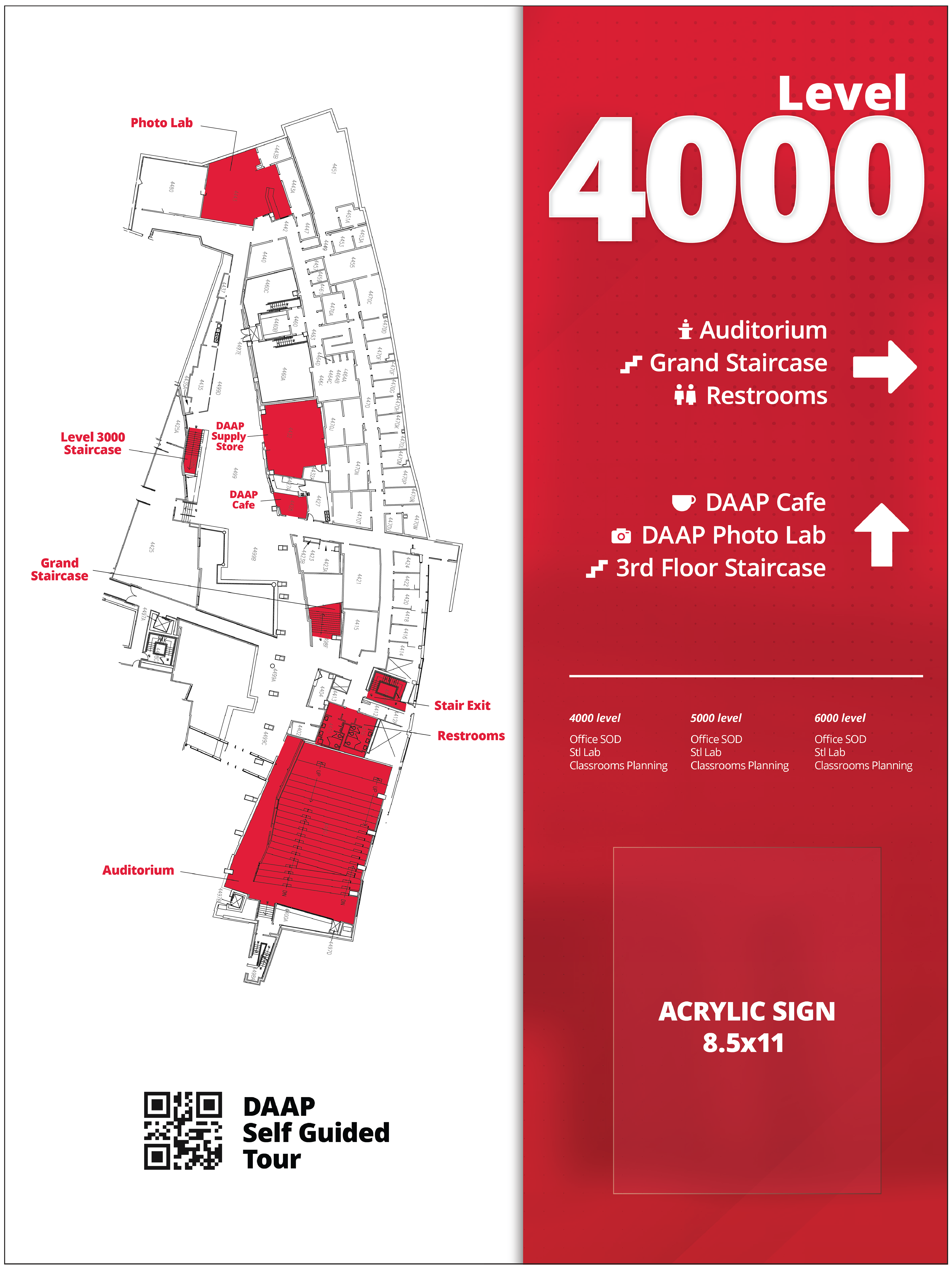
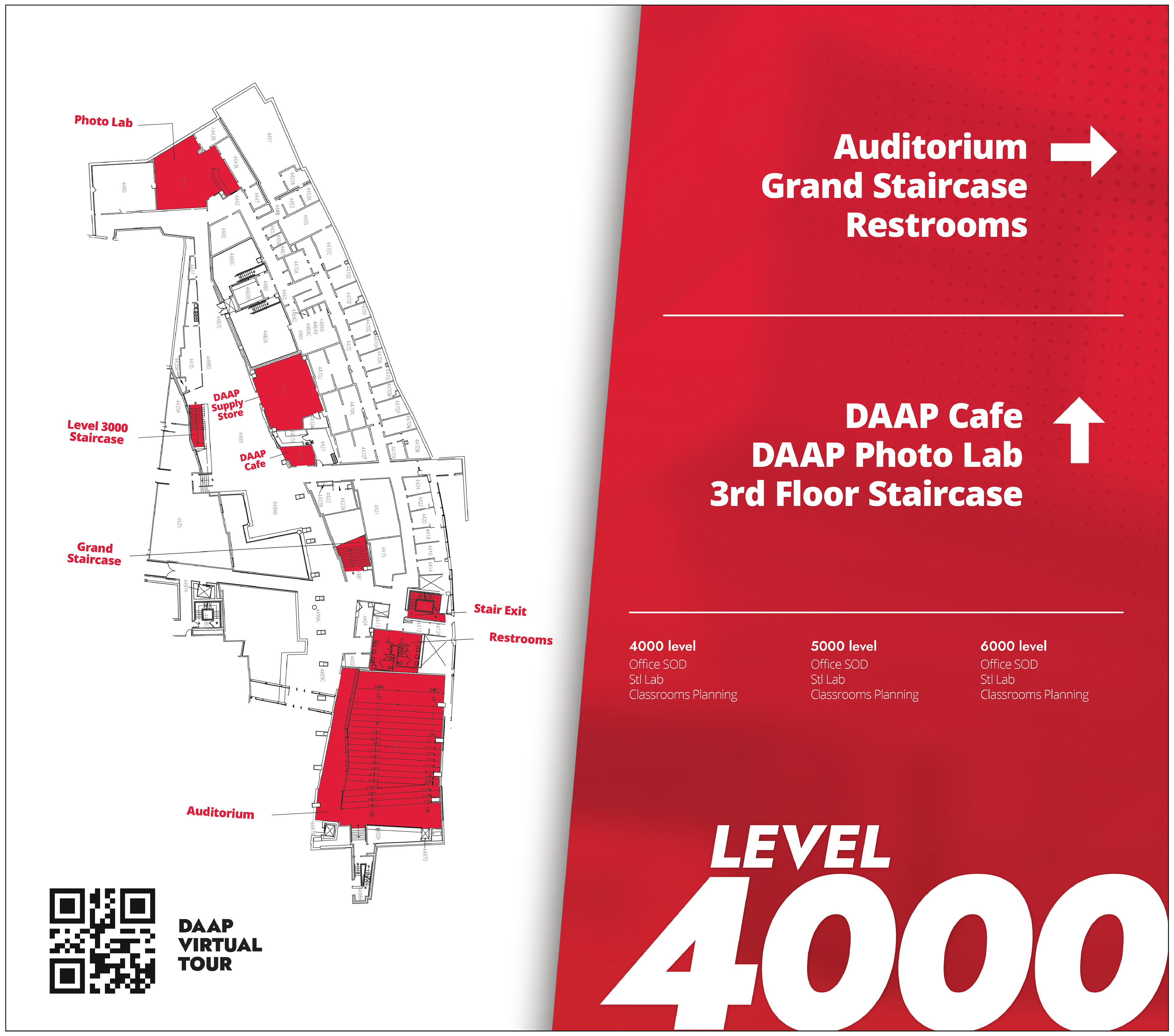
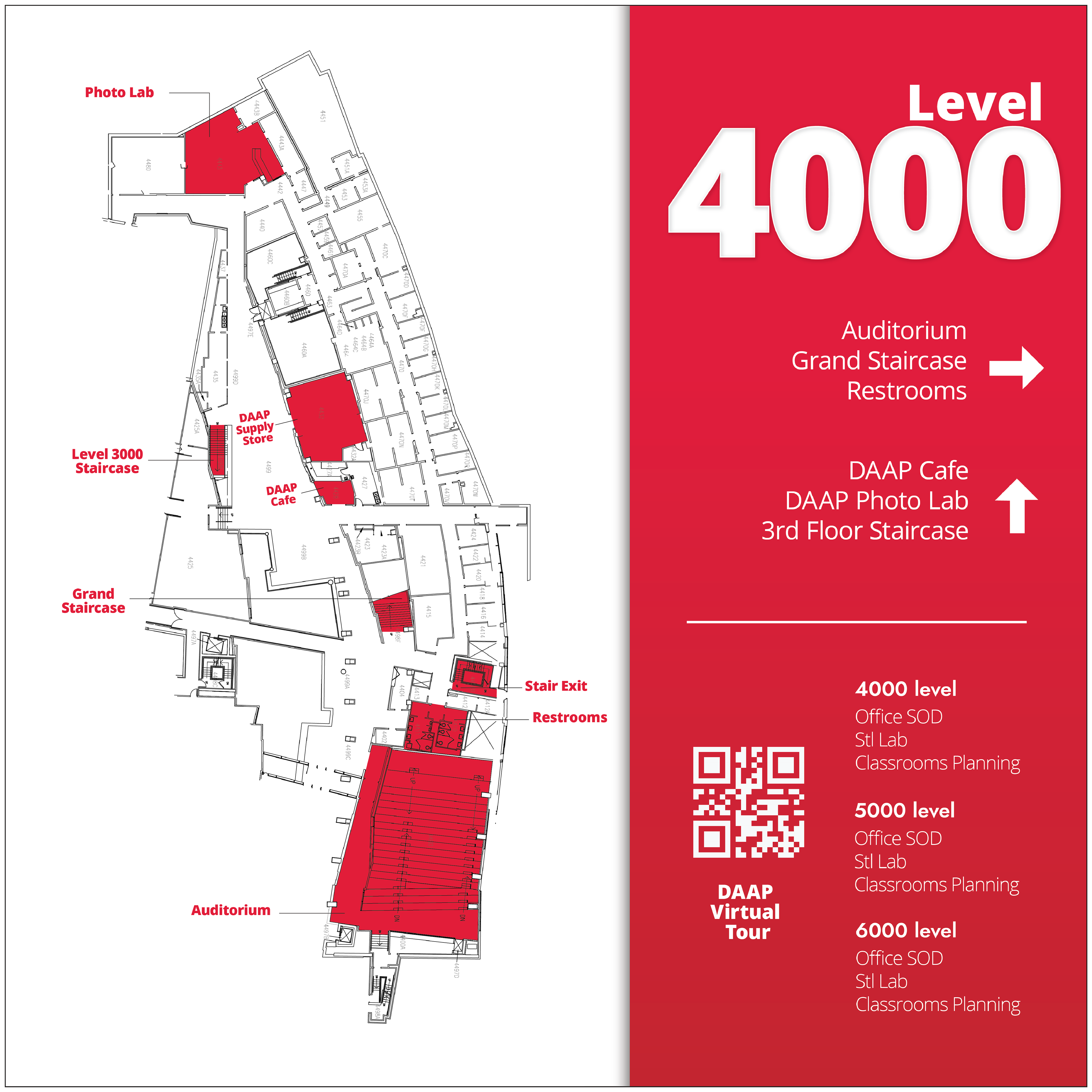
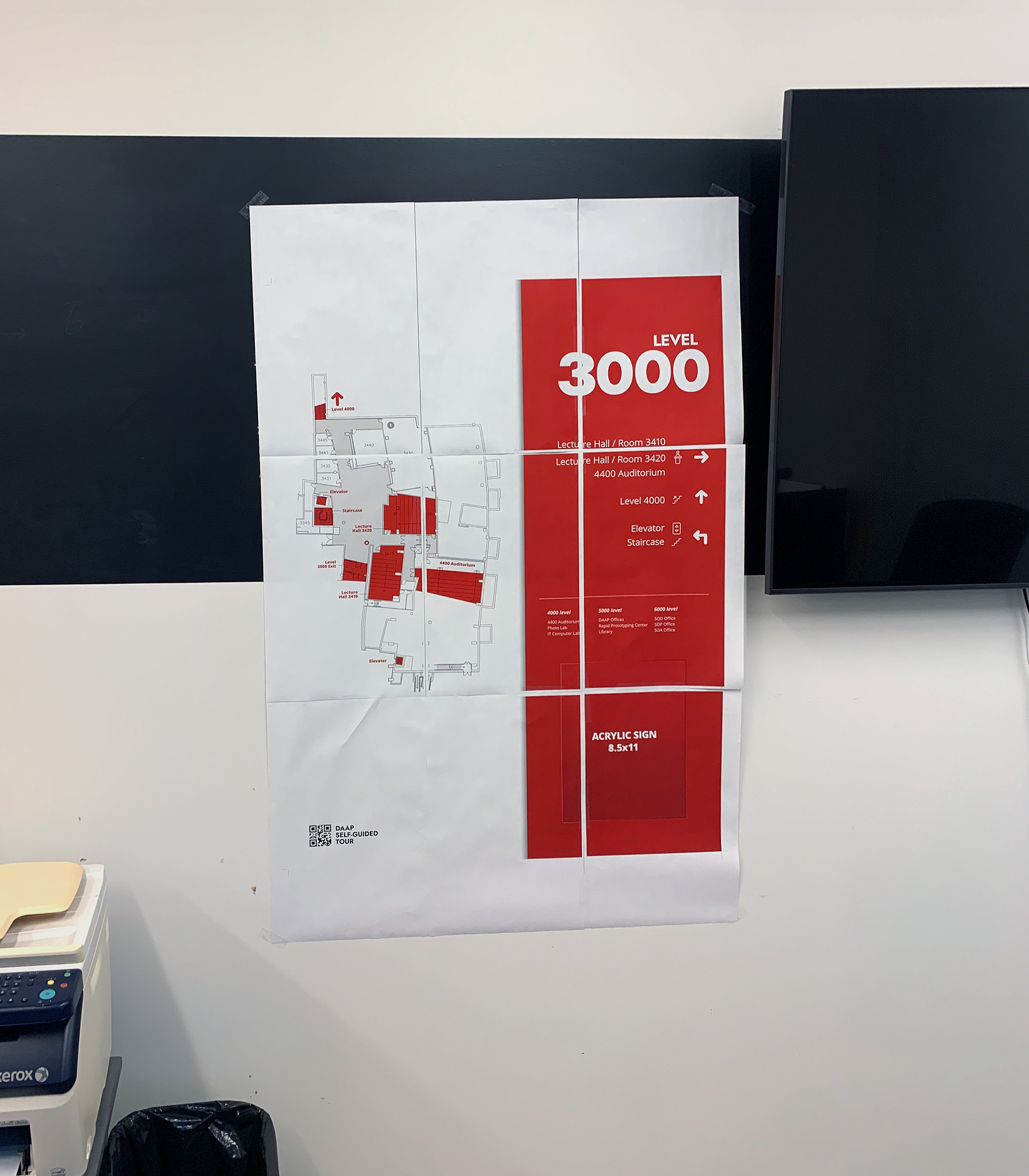
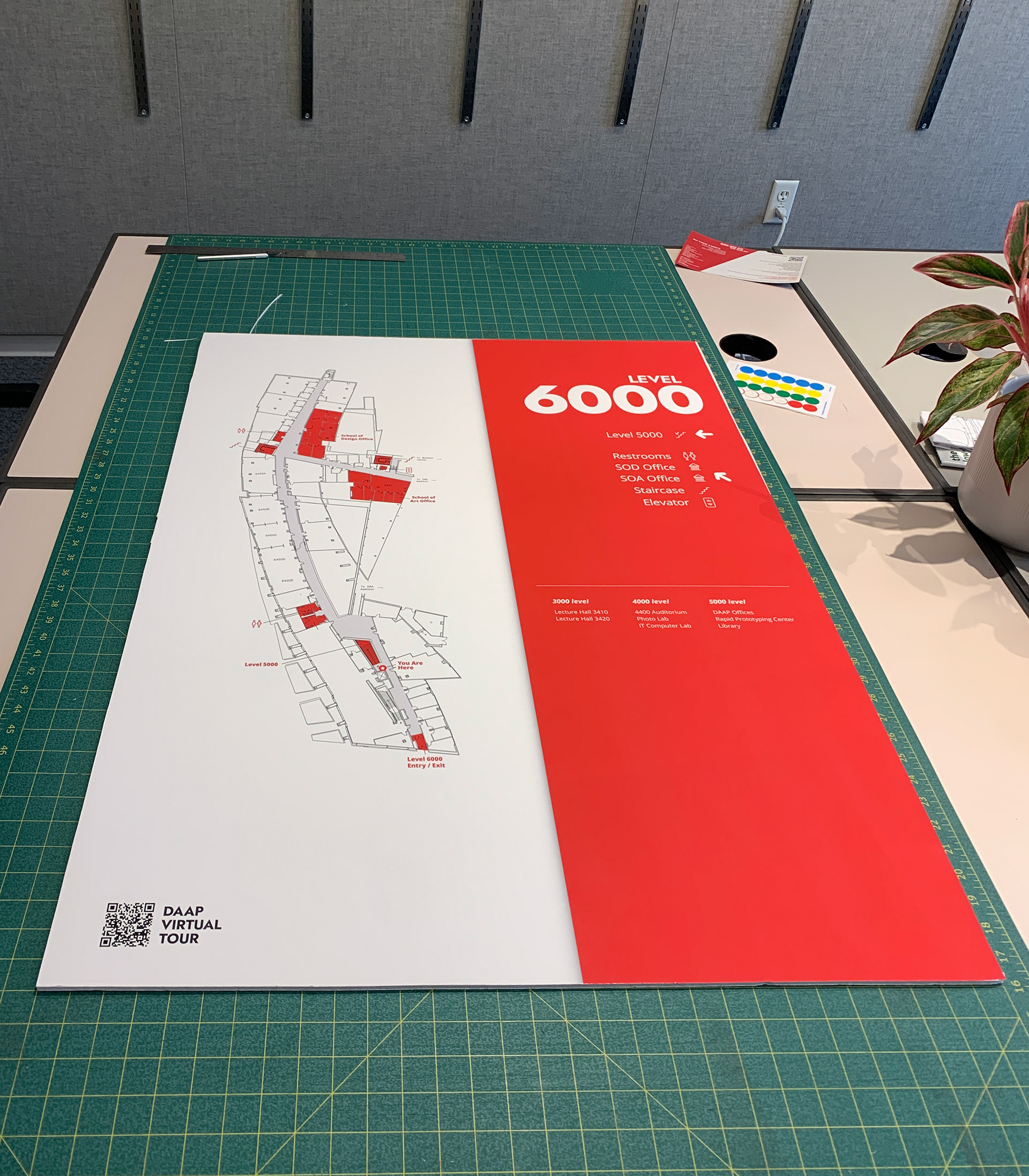
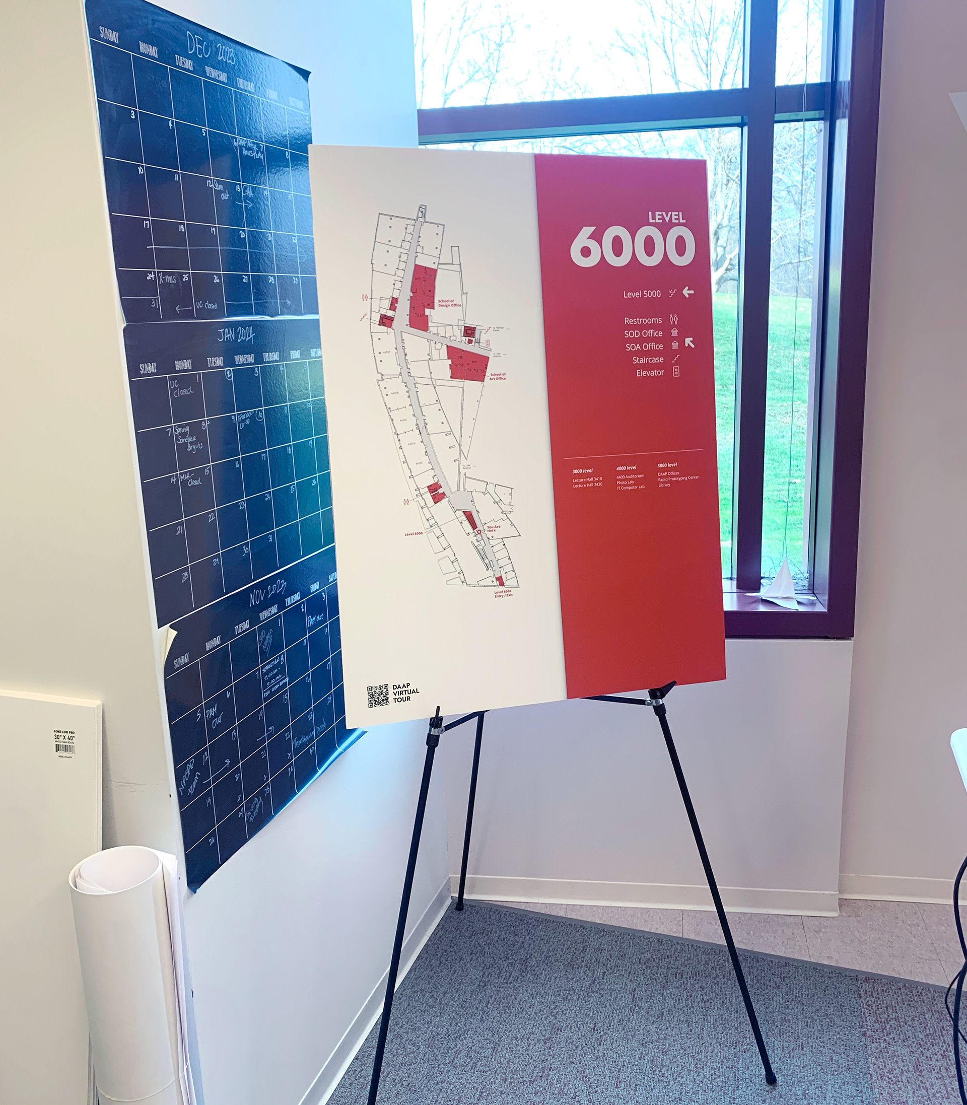
To understand a sense of typographic scale and legibility before finalizing, I printed one sign-to-scale across twelve 8.5x11 in prints and hung it on the wall of the office. Physically printing the draft allowed me to recognize spacing issues with navigational typography and icons. Below are images of the assembled draft, cut final print, and glued final print on 30x40in" poster board.
Pictogram / Iconography Design Process
In developing iconography to represent the key areas across each DAAP floor, I first consulted Pinterest to determine successful iconography applications and inspiration cases. Taking from my inspiration, I produced two sets of icons to be used in the project, ultimately settling on the outlined format
Final Project Prints
